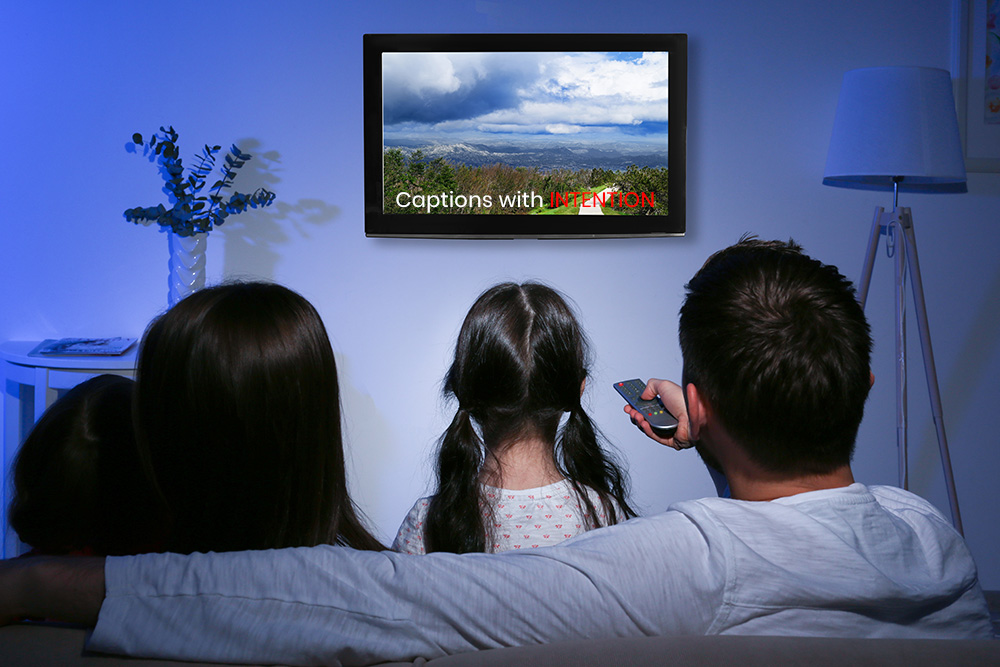
Closed captions are created for deaf and hard of hearing audiences. The principle of using closed captions is to ensure all speech and sound is accessible to a deaf audience, and to ensure any relevant contextual information is also supplied (e.g. identification of speakers). The true accessibility of video closed captions can be largely effected by formatting guidelines, styles and specifications. When creating captions, the following formatting video closed caption formatting elements should be considered.
Vertical Positioning of Video Closed Captions
Changes in the position and placement of closed captions can create a better experience for deaf or hard of hearing viewers. Traditionally, closed captions are placed at the bottom of the screen, in a centralised position.
This is considered the best placement to allow as little visual distraction to the video as possible. However, video closed captions may need to be re positioned in some cases; such as when there is text or information present in the video that is being obstructed by the subtitle. Some caption formats allow for measured and specific re-positioning of on-screen text; others allow for options which include text at the bottom, top or centre of the screen; whereas some formats do not allow caption positioning at all.
The choice of closed caption transition style you choose is up to you, but please bear in mind, different production companies or broadcasters may have specific subtitle transitions that they expect to be implemented for all of their videos.
Closed Caption Formats
Broadcasting channels, television service providers, video-on-demand service providers or production companies often specify which format they use as a house style for all closed captions. There are hundreds of fonts to choose from, and video closed captions can use fonts which match the tone of a video, other products or company branding or otherwise be set to the most basic Arial for ease of reading. Closed caption formatting also allows for font changes such as bold, italics, underline and other formatting standards that you would expect within typical word processing software.
Closed Caption Colours
When adding captions to videos, text colour changes can make all the difference. Different colours can be used to indicate change of speaker. They can also be utilised where colour clashes take place between the video and on-screen text which impact on the visibility or readability of your closed captions.
Video Closed Caption Transitions
There are three standard caption transitions that can be used for video: pop-on, roll-up and paint-on.
Pop-on Captions
The on-screen text pops onto the screen all at once as one to three lines of text; the text is visible for a few seconds, before vanishing or being replaced by the next caption.
Roll-up Captions
The captions appear vertically one line at a time. The on-screen text rolls upwards to allow for the next line beneath it before disappearing. Usually roll-up closed captions allow a maximum of three lines of text. They are typically utilised in online or live captioning.
Paint-on Captions
Similarly to roll-up subtitles, paint-on captions appear in stages, with words displaying from from left to right, creating a paint-on effect. The choice of closed caption transition style you choose is up to you, but please bear in mind, different production companies or broadcasters may have specific subtitle transitions that they expect to be implemented for all of their videos.